GREEN ELEVATOR CANNABIS
THC GUMMIES AND SELTZERS
Design | Logos | Illustrations | Photography | Print Collateral | Sales Sheets
Green Elevator Cannabis isn’t just a brand—it’s a journey. The tagline says it all: “The Elevator Will Take You Where You Want To Go.” That vision became the foundation for everything that followed, from branding to packaging.
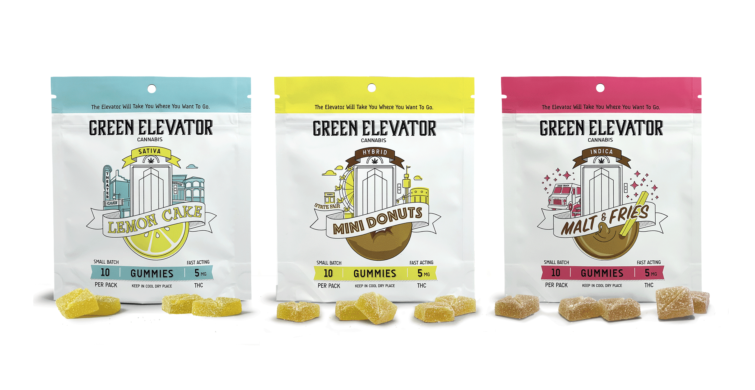
I kicked things off by creating a sleek, modern art deco logo with an eye-catching elevator graphic—setting the tone for a brand that’s all about elevating the experience. Then came the packaging for the THC gummies. Since Green Elevator is a local Minnesota company, I pulled inspiration from the Minneapolis Metro area. Each flavor got its own unique vibe, with a central elevator graphic surrounded by imagery representing the taste—whether it was lemon, malt & fries, or mini donuts.
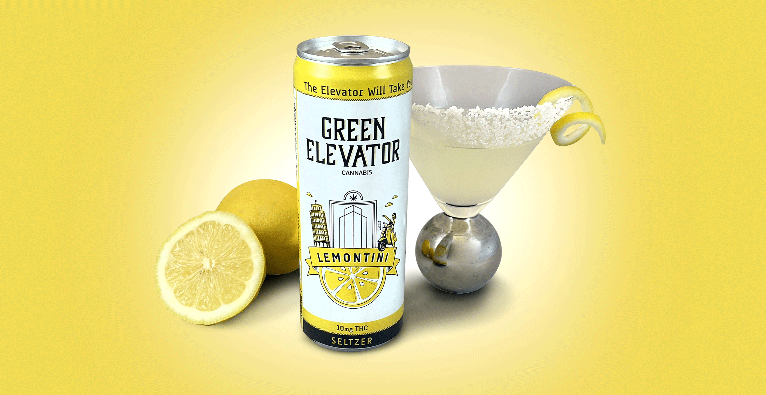
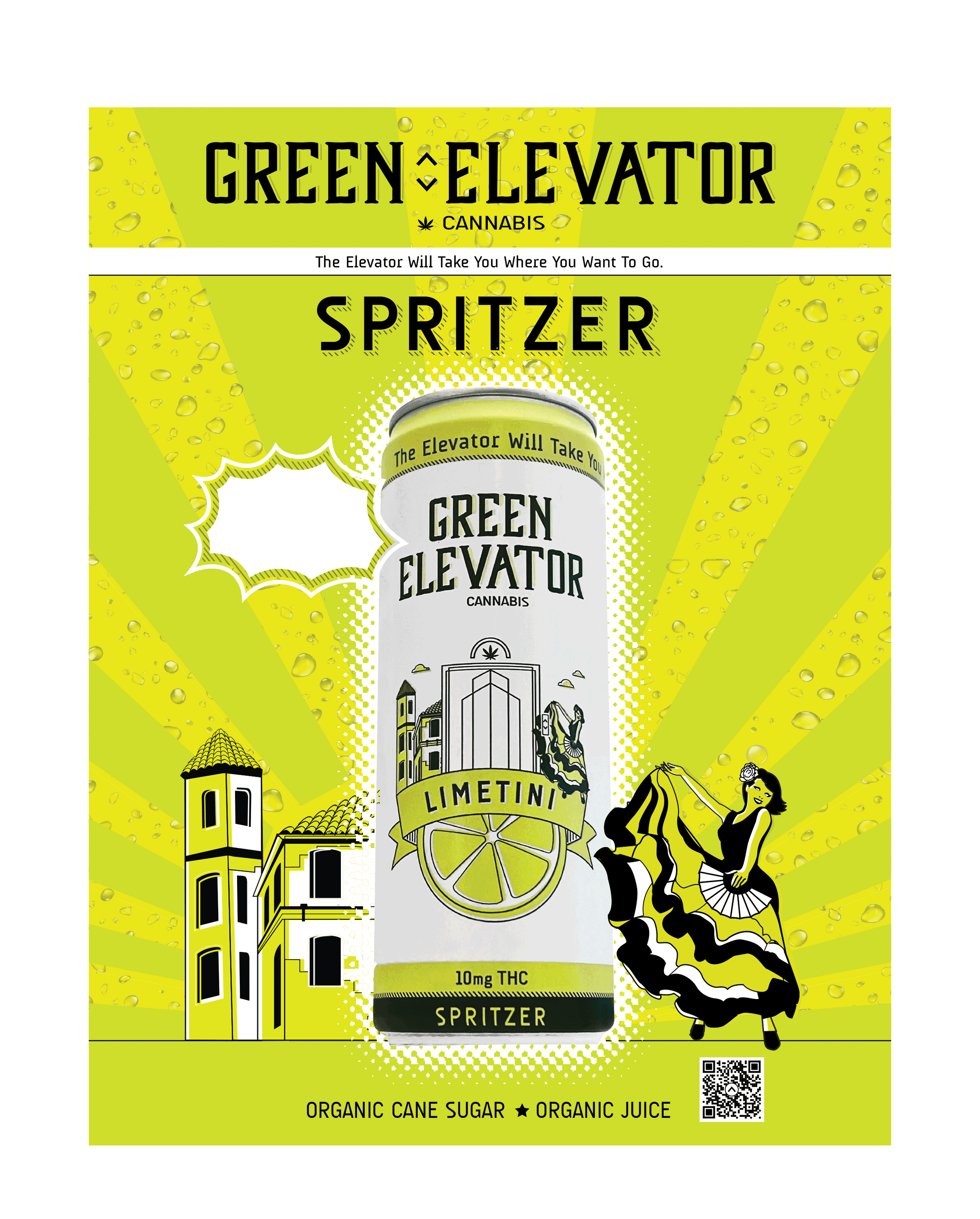
Next up: The Seltzers. We wanted to take consumers on a trip around the world, so I researched where each fruity flavor originated. The results?
🍋 Lemontini (Italy) – A chic Italian girl zipping through the streets on a Vespa, with the Leaning Tower of Pisa in the backdrop.
🍈 Limetini (Spain) – The same stylish woman, now a Flamenco dancer, framed by a picturesque Spanish villa.
🍊 Orangetini (Florida) – This time, she’s cruising in a vintage T-Bird, rolling past Miami’s iconic art deco hotels.
Beyond packaging, I expanded the brand’s presence with sales sheets, social media visuals, a website, and custom photography. Every piece worked together to create an immersive, transportive experience—because with Green Elevator Cannabis, the ride is just as fun as the destination.
DESIGN IS A PROGRESSION
I created clever design. Using the aluminum of the can itself to simulate the silver of an actual elevator is a smart way to create depth and realism while keeping the print minimal. It gives it a sleek, high-end look too.


The Elevator Will Take You Where You Want To Go
The Elevator Will Take You Where You Want To Go
MISC. LOGOS

SELTZER CAN PHOTOS AND PROMOTIONAL ARTWORKND


SELTZER CAN POSTERS


SALES SHEETS

GUMMIES PACKAGE DESIGN


PACKAGING GRAPHICS

COMING SOON: THREE GAME-CHANGING DESIGNS!
We've got not one, not two, but THREE fresh new designs waiting in the wings, and trust us—they’re worth the wait!

SALES SH EETS

WEBSITE DESIGN

PROMOTIONAL ARTWORK


APPAREL DESIGN
Green Elevator Cannabis graphic takes center stage on the front—because let’s be real, when you’re making a sale, that’s what the customer sees first! Flip it around, and boom—the logo is stretched across the back, turning you into a walking billboard as you cruise through festivals and markets, catching eyes and sparking curiosity. It’s all about making an impression from every angle!


Fat Nug Magazine
Check out the article for creator spotlight;
https://www.linkedin.com/feed/update/urn:li:activity:7240328380603117569/


Fat Nug Magazine
Check out the mention of the package design for Green Elevator Cannabis at;
“The packaging is awesome. Excellent, inviting design, calm colors and the white bag does the yellow and light blue justice. You hit it out of the park with this, brotha”
Herbal Profiles
Check my interview with Lars Miller with herbal.beehiiv.com at
https://herbal.beehiiv.com/p/creator-spotlight-steve-meyers-graphic-designer
The Packaging
These came in the standard child-resistant edible bag I will forever have to curse at to get open. Typically you see bright, eye-catching colors and designs. Green Elevator took a simpler approach. The white backgrounds let the colors pop and make them stand out in a way that others don't. The design is simple, but gives toned-down Great Gatsby vibes. They feel fancy, but the effects were, of course, the best part.